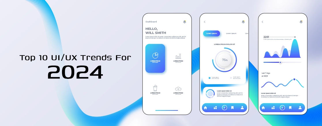
It is the web era of super-competitiveness today, and your boot-up is your initial—and, as it happened, ultimate—opportunity to make an enduring impact. That is, your UI/UX design makes an impression on a visitor or redirects them to the competitor.
You would assume, then, that the biggest brands would be better than that. And yet even the biggest brands unknowingly shoot themselves in the foot with some basic UI/UX errors.
Be you're a fresh startup that needs to grow or a big company that needs to remain plugged in, bad design will cost you conversions, trust, and eventually, money.
At Trust Haven Solution, best-rated UI UX Design Agency in the USA, we've walked through dozens of hundred websites. We've repeated errors. Let's dissect the 10 most popular UI/UX errors that could be destroying your site's performance—and replace them with cool ones instead.
1. Cluttered Navigation
If your users have to think in order to be able to move around on your site, you've already lost them. Cluttered menus, distorted layouts, and obstructed navigation items create friction.
Simplify your menus to be plain, consistent, and readable. Borrow good design patterns from what your users are already familiar with. Limit your top-level navigation to 5–7 items max.
Trust Haven Solution: Monitor where users are getting stuck or dropping off with heatmaps.
2. Slow Load Times
A great-looking site is useless if it never loads. Google estimates that over 50% of site traffic will bounce if a site doesn't load within 3 seconds.
Optimise images, cut back on scripts, and include lazy loading. If needed, switch hosting providers to a quality one.
Load times are not just a UX issue—they affect SEO, bounces, and conversions.
3. Non-Responsive Design
If your website still doesn't work whatsoever on a smartphone, that's a 2025 deal-breaker. Over 60% of visits are now on smartphones, a desktop design is digital suicide.
Utilize responsive frameworks that will automatically split up by screen size. Test rigorously on a wide selection of devices.
Trust Haven Solution prefers a mobile-first design. Design the smallest screen first and scale up.
4. Poor Readability
You may have great content, but if it's hard to read—small font, low contrast, tight line spacing—it doesn't matter.
Use readable font sizes (at least 16px body), normal line height, and sufficient colour contrast between text and background. Don't use too long blocks of text.
Use subheads, bullets, and images to break up content into short paragraphs so scanning is easy.
5. Lack of Visual Hierarchy
Not everything is equal. If your site doesn't make anything obvious, your visitor is going to be standing around wondering what to look at—and they'll be gone.
The solution: Guide the eye. Use size, weight, colour, and position to signal importance. Headlines should leap. CTAs should jump out. Secondary copy should play subservient background roles.
A UI UX Design Firm in the USA, like Trust Haven Solution, knows how to design pages that can effortlessly guide users from interest to conversion.
6. Too Much Pop-Up Overuse
Pop-ups do work. But when they start to annoy too quickly, or for the wrong reasons, they kill the experience.
The answer: Restrict pop-ups. Have them come up after interaction—i.e., 50% down-scrolling or 30 seconds on-page. Always make it easy to close.
Important point: Google penalizes mobile intrusive interstitials. That's a UX issue and an SEO issue.
7. Unpredictable Design Elements
Unpredictable fonts, spacing, color schemes, and buttons yell "unprofessional." Worse, they annoy people and kill trust.
The solution: Consistency. All of this here—buttons, headings, icons—is done just the same way. It makes your brand rock-solid and eliminates the friction.
We always produce one design system at Trust Haven Solution before scaling out pages or apps.
8. Weak or Unclear Calls to Action
Your CTAs must be legible from the background, and using weak words like "Submit" or "Click Here" is leaving cash on the table.
The fix: Your CTAs must be concise, brief, and in your face. Action verbs are the secret: "Get My Free Quote," "Start My Trial," "Download the Guide".
Design recommendation: Get your first CTA in the visitor's line of sight—large text, high-contrast color, and in the right location (above the fold, and after value-incentive copy).
9. Omission of Accessibility
Omission of accessibility isn't necessarily immoral—It's a cost and legal obligation. There are many millions of users who use screen readers, keyboard-only navigation, and other assistive tech.
The solution: Just adhere to WCAG standards. Semantic HTML, good alt text, keyboard-accessible structure, and sufficient contrast.
Universal design is optimal for everyone. And if you care about development, you can't afford to exclude 15 %+ of your potential customers.
10. No User Testing
Designing from the premise that you are the one who's going to use it is the path to perdition. You're not your user.
The solution: Test early and often. Do usability testing, A/B testing, and observe how real people react. Make changes based on behaviour, not assumptions.
Trust Haven Solution, being one of the top UI UX Design Agencies in the USA, incorporates validation into every stage of the design process. We don't think afterthought. It's a habit.
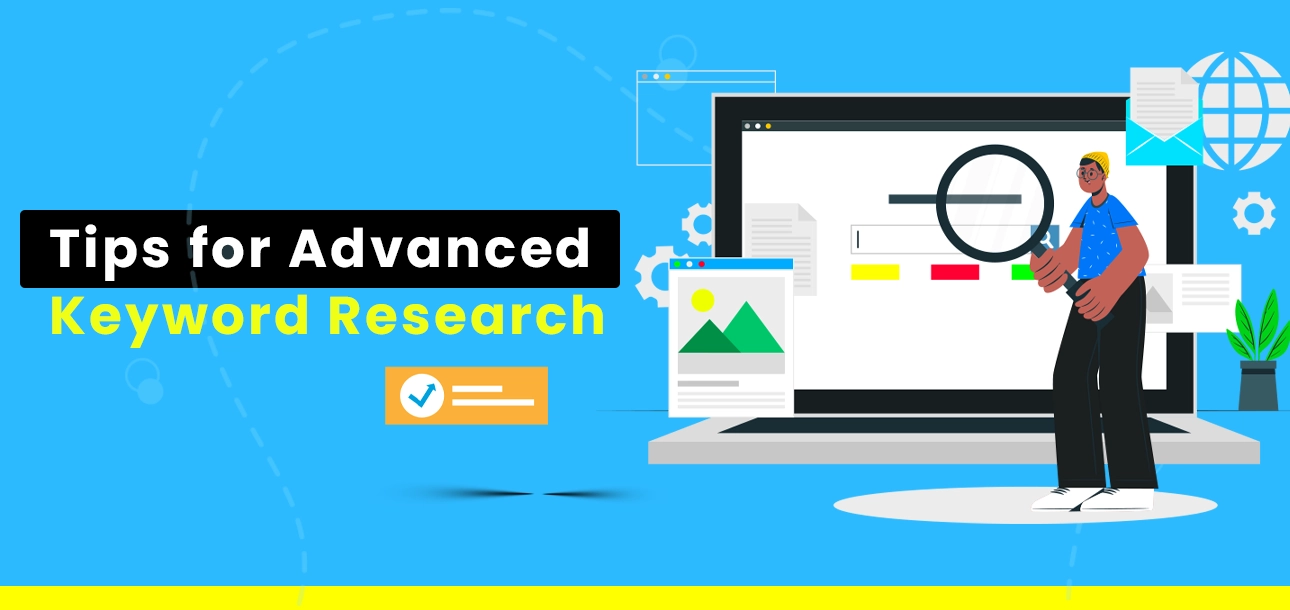
Read Also: Social Media Marketing Trends You Can’t Ignore This Year
Bonus Blunder: Forgetful Microinteractions
All of those small animations and feedback blips when you tap, swipe, or hover? Not polish—telling behaviour, showing action, and creating joy.
Add thoughtful microinteractions. Consider button hover, form validation, and scroll effects. Just don't do too much—every animation needs to have a reason to be.
Closing Thoughts: Design Isn't Decoration
UI/UX isn't about getting something "pretty." It's about solving problems. Done correctly, design manages behaviour, builds trust, and creates conversions.
Done incorrectly, even the best product or service can be destroyed by friction and confusion.
If your website is slow and you're not sure design could be the culprit, it's time to act. Have a pro handle it and you'll be rolling again in a jiffy.
At Trust Haven Solution, we're not your ordinary UI UX Design Agency in the USA. We believe in strategic, people-centered design that turns ordinary websites into high-impact tools.
Need a keen diagnosis of what's holding back your site? Let's discuss. We'll locate the friction and trim it out.
Rapid Review – 10 UI/UX Mistakes to Avoid:
1. Annoying Navigation
2. Squandering Website Speed
3. Non-Responsive Design
4. Poor Readability
5. Insufficient Visual Hierarchy
6. Excessive Pop-Ups
7. Flakey Features
8. Poor Calls to Action
9. Omitting Accessibility
10. Not User Testing
Read Also: A Complete Guide To Ecommerce Website Development For Beginners
Struggling With These?
Call Trust Haven Solution, the UI UX Design Agency in the USA that companies trust to create digital experiences that work.
Your website needs to be your best salesperson. Let's ensure that it's not driving customers away.

.webp)

.webp)
.webp)

 (1).webp)


.webp)
.webp)
.webp)


.webp)


.webp)

.webp)


.webp)

.webp)
.webp)


.webp)
.webp)
.webp)

.webp)
.webp)
.webp)
.webp)


.webp)
.webp)
.webp)

.webp)


.webp)

.webp)


.webp)
.webp)

.webp)


.webp)


.webp)
.webp)


.webp)
.webp)
.webp)


.webp)